In Part 1 I went over how to Organize your website and then discussed the Navigation of your site. In Part 2 I covered the design of your site and in Part 3 I went over the Layout and Accessibility of your website.
Now, in the concluding part of this 4 part series on good website design, I’ll go over 3 examples of bad website designs, followed by 3 examples of good designs.
Examples of Bad Websites

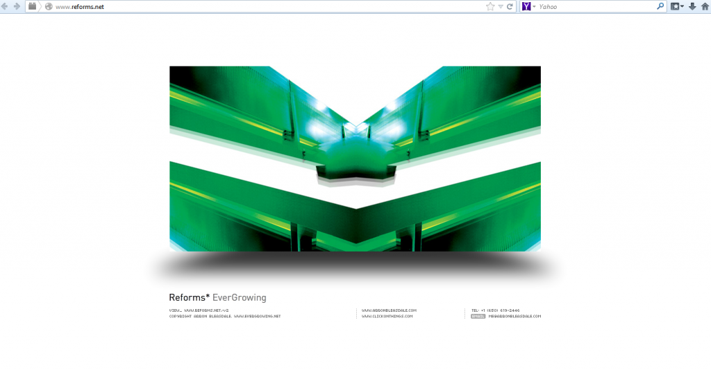
www.reforms.net: This site completely ignores the concept of above the fold, or a clear navigation. I have absolutely no idea who these people are, what they do, or why I should care. I have no idea how to find that info, I can’t see a link anywhere. This site fails miserably to meet any criteria for a good website design.
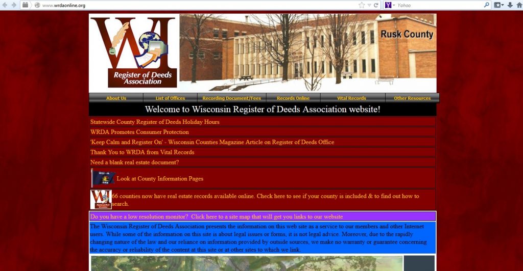
 http://www.wrdaonline.org/: This site also breaks multiple rules for how to design a good website. The first thing I see is a colour scheme that’s unattractive to me, in fact I find it outright ugly. Second, there is text with poor contrast, do you see that yellow text inside the magenta background? Or the black text inside the blue background? Sure. But it’s not easy to read, is it? Neither is the yellow text on red for that matter. Also, the image that you can just see the top of, took forever to load when I visited this site.
This site fails in providing something compelling above the fold, it fails in keeping the site performance up, it fails in providing a visually appealing experience, and if fails in providing readable text with sufficent contrast.
 http://www.spectrumpowderworks.com/: This site also provides no above the fold information or grabber to give me a reason why I should even bother being here. Can you see the navigation menu at the bottom? I didn’t at first, medium gray text on a light-medium background? How could the designers expect anyone to see that text, let alone read it? Also not obvious at a glance is that the row of pictures in the middle is actually clickable, each image is a link to a different page, but to what? I have no idea from the pictures.
This site fails to provide sufficient contrast to make the text readable, fails to provide a clear navigation and fails to provide any information about who the heck Spectrum Powderworks is and what they do. In fact, there are so many flaws with this website that I really can’t go into them all here.
All three of these examples are case studies in how not to design a website, they all pretty much violate all the principles of good website design.
Examples of Good Websites
 http://wistia.com/: This website may not have any text description above the fold, but it does have a descriptive video that meets the requirement of a good grabber. Which is kind of fitting considering this is a website about video hosting. The navigation is clear and consistent, and the text has good contrast. The one failing this site might have is in accessibility, but everything else is in line with the principles I talked about in my The Anatomy of a Good Website series.
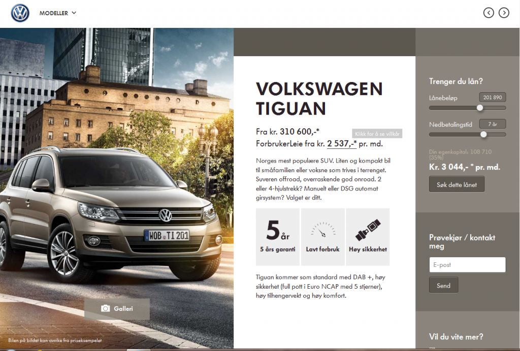
 http://taktisk.volkswagen.no/: This site does meet most of the criteria for a good website. The one failing I could see what in the home page with was rather barren, and could have benefited from saying something more about this site and why I should look for a new car there, instead of somewhere else. Once I got past this page though, the benefits of this site were clear, and I have no trouble finding my way around it, dispute this site being in a foreign language I don’t understand.

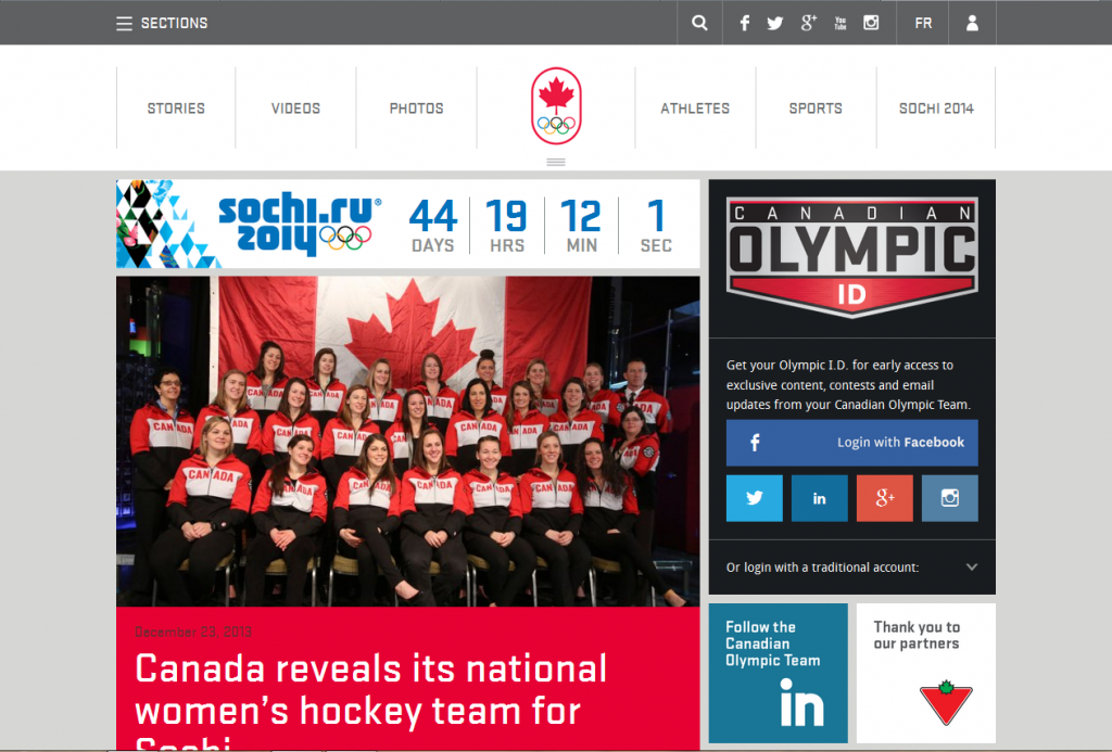
http://olympic.ca/: This site also does have interesting information above the fold, in this case in the form of a recent blog article. Now they could have done a bit better by having more about who they are, but the navigation is very clear, and it is simple enough to find an About page with that info and everything’s easy and attractive to read. Well, I do have to admit a bit of bias here too though, as I am Canadian and do love my Olympic team, but still, good design is good design and while our Olympic Team could have done better with providing some above the fold attention getter, everything else is spot on.
Thank you for reading this series of 3 rather long posts and I hope they helped you in understanding how to get your website design right.
If you need more info on how you can improve your website design or how to get started I’d be happy to give you a free consultation, just contact me or comment below to answer your questions.


