In Part 1 I talked about designing the Organization and Navigation of your website, and in Part 2 I talked about the Design of your website.
Here, in Part 3, I will cover the Layout of your website and why and how to make it Accessible to as many visitors as possible, including those with physical difficulties, such as the blind and deaf.
Layout
By layout, I’m referring to how you organize your pages.
The typical layout goes something like this:
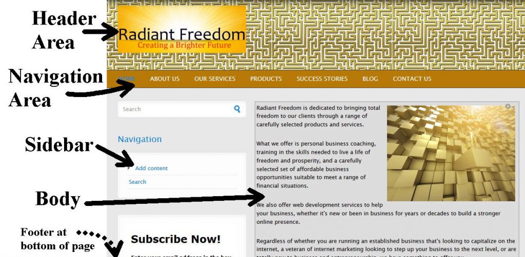
At the top of the page are the Tittle/Header Sections. Below those is your own site’s internal navigation section. Next you may have a sidebar with a secondary internet navigation section, and some supplementary contents like exclusive offers, banner ads, external navigation (to other web sites), and blog/news feeds. Then you have the main body of your website, with would be displayed beside your sidebar and would take up the majority of the page. Finally, you would have a footer section at the bottom of the page with things like copyright info, developer info, webmaster contact info and when your site was last updated.
Sites may omit some of these sections, or add other sections in, but these are the basic sections typical to the vast majority of websites.
The main thing in your layout is that is must match what your target audience expects, be visually appealing, easy to follow and find information on your pages, and most of all be consistent on all pages of your website!
Here’s an example of a standard modern layout: Accessibility
This is another vital part of your website, as this affects who can access your website and gain a benefit from it. If your website is all flash animations and many visitors are blind, they won’t be able to get anything from your website or do anything but leave. To a blind person relying on assistive technologies like screen readers, a flash/graphical site will be unreadable, unless you design an alternate text only version and some way to detect when that version is needed.
Likewise a video and sound intensive site will mean nothing to a deaf visitor who can’t hear anything, so be sure your website does not rely on these media exclusively, all contents accessible through such media should also have a plain text version that anyone can understand, regardless of any physical limitations.
A good way to make that happen is don’t design a flash website, use good old HTML (HyperText Markup Language) and you won’t shut anyone out of your website. Make sure visuals have a text description; with most pictures there is a feature called “alternate text” that does this and this text will appear if the image itself cannot, such as if the link to the image is broken or the visitor is using a screen reader. Any sound used on your site, such as a video presentation or audio file that contains information important to your website should have a text transcript so those who can’t hear it can still read it, and those who can hear it can listen and read along if they want to.
Be sure to tune in to Part 4 for some examples of both good and bad web site designs.


