In Part 1 of The Anatomy of a Good Website, I went over the basics of your website’s structure and navigation. There are still three areas yet to go over. In today’s post I’ll cover Design. This is a big topic and needs a whole post just to do it justice.
Design
This is where you decide on what your website’s going to look like.
This will have a strong effect on your visitors’ overall experience and how likely they will be to come back again. This includes what I went over in Part 1, that being Structure and Navigation, which are both parts of Design, but Design also includes such things in what fonts you choose to use, what size of text, what colours and graphics you use, whether or not you use borders, buttons, or plain text links, and so much more – basically everything that effects the look, performance and functionality of your website comes in under design.
So what are the things that make up a good design?
Consistency
When viewing the different pages of your website, certain things must remain consistent throughout, regardless of what page they’re on. The overall layout (where things are located on the page), the colours used, fonts, navigation, etc. all need to follow a consistent theme or look.
Part of consistency also includes a logical arrangement of your pages, such as grouping similar or related things together. Such as grouping your main navigational links together in one area on the page, or grouping a list of recent blog posts. This ensures people can easily find the contents on your pages without excessive searching around.
Contrast
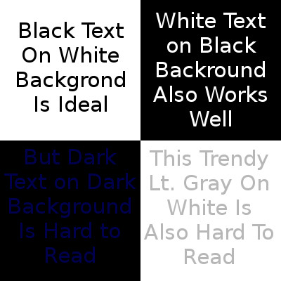
This is one of the most powerful tools you can use on your website. It makes text readable (or not) and can draw attention to a particular area on the website.
 The most important use of contrast is to make sure there is enough contrast between the colour of the text, and the background behind it. If the background is a dark colour, make sure the text is a light colour then, if the background is light, then use dark text.
Contrast can also draw attention to an important part of your page. For example, if most of your page is a light blue, you might want to make the navigation section a dark blue, or bright red to make it stand out and be noticed. You might put a red background behind an important announcement that you want to make sure visitors see, as another example. In this case, it’s a major change in the normal colouring of your website to make something stand out and get noticed.
Above the Fold
This is a term taken from newspapers where it refers to the contents of the page that are visible above where the page is folded over. This is the first thing a customer browsing newspapers sees, so it better be big, and it better grab the viewer’s attention fast, this is what sells that newspaper.
In web design, Above the Fold is just as important, or perhaps even more so, then with newspapers. There are literally tens of millions of websites out there all competing for your visitor’s valuable time, and your visitor will usually take about 5-10 seconds at most to decide whether or not to stay on your website. In web terminology this refers to the part of your web page that first appears on the screen when a visitor links on that page.
So, you had better have something very interesting, informative and compelling to grab the visitor’s attention fast, you have only 10 seconds (and usually less) to convince the visitor to stay on your site and look deeper.
This means put your best contents at the top and make them as attractive as possible. A cool picture, a must-have product or an amazing blog post does you no good if the visitors leave your site before they even see them. So put something at the top of the page that visitors will see without doing anything but look at the screen, something that grabs their attention and pulls them into those contents you really want them to see.
Here is an example of what happens when a web developer fails to put interesting and informative contents above the fold. Although this is an older style of website most popular around 2008 or so it is an example of how positioning interesting and informative contents above the fold should be done.
 Performance
It’s no secret that people don’t like to wait. The longer your site takes to load up, the less time you have left to grab the visitor’s attention, and the more likely they’ll leave before they even see what’s above the fold on your website.
As a rule of thumb, most visitors will leave a website that takes more than about 2 seconds to load. So those cool super high-res graphics and flash animations may look great, but they’ll slow your page’s load times down and enough of them will mean no one will stick around to see just how great they look.
Designing a great website is all about a balancing act between high quality contents, and fast loading pages. The higher the quality, the slower the pages load, the lower the quality, the faster the pages load. On the other hand, the lower the quality, the worse your pages look, and the better the quality, the better your pages look, so you much find that middle ground where you get the best quality contents (such as graphics, animations, video, etc.) you can, without slowing down the time it takes to load the pages. If you can keep your pages to loading within a second or less, you’re in good shape. If it’s well under a second, you can probably afford to upgrade the quality of your contents without it harming the performance of your website.
Above all, Design for your target audience!
Be sure to tune in again for the next installment of The Anatomy of a Good Website Design.


