As a web developer, it’s about time I gave you some tips about how to develop a good, well-designed website. I’ll go over the basic principles of a good website, and also what can cause a bad design. I’ll then give you some examples of both good and bad designs for websites.
There are 5 main things to keep in mind when designing a website:
- Organization
- Navigation
- Design
- Layout
- Accessibility
This is a huge topic and I could easily write an entire textbook on it, but I’ll give you the basics here this week, in a 4 part series.
Organization
This is how your pages will be organized and accessed by visitors. There are three main types of organization for your website:
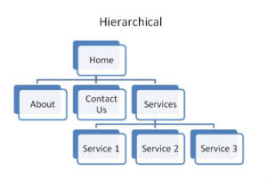
 Hierarchical:
- This is the most common design for websites, it usually starts at a Home Page (or Front Page) and the user then digs down into other pages.
- Linear:
- This style of organizing a website is mostly used for a tutorial or training manual, where each page is accessed in sequential order, starting with the first page, followed by the second page, and so on, up to the last page.

 Random (A.K.A Web):
- This style of organizing is not commonly used. It features no real home page, hierarchy or order in which pages are accessed. Where you would be most likely to find this structure would be a social media site like Facebook or LinkedIn.
So now you know what types of structures you can use, what one do you choose? The best answer to that depends on what the purpose of your web site is. If you’re doing an educational site with training and tutorial contents, you might want to use a linear structure, at least for the training sections. If you’re doing an e-commerce or general info site, you’d probably want to use a hierarchical structure as that will help visitors find the products/info they came to your site for the fastest. So what your site is meant to do will play a pivotal role in how you organize your site’s pages.
Navigation
So now you have set up the structure of how the pages on your website will be organized, what next? Well, now you need to figure out how people will get to those pages, in other words, your site’s navigation.
The importance of a good design in your site’s navigation system can’t be overstated. This is how visitors find your products, services and information. If it’s poorly thought out and illogical, visitors will not be able to find what they came there for, and you’ll lose them for good.
Consistency will help visitors find a particular page regardless of where on the site they are at that moment, whether on the home page, a blog post, or any other page. Choosing a location and sticking with it will allow visitors to find your navigation system easily. Logical organization and structure of your information and navigation system will ensure visitors will find information exactly where they would expect to find it. So if a visitor is on your “How to Use Our Goo-Gog” page and wants to find out more about your company, they would expect to be able to go to the main navigation area and click on some sort of “About” page to find that information. So put it there.
Over the years trends in navigation have come and gone. Nowadays sites can use many different methods. About a decade ago, a sidebar was the most popular place to put a site’s main navigation, before that it was a simple list of links near the top of the page.
Nowadays, it’s usually in a menu of links or buttons that lead to the most important pages on your site, with sub-pages layered beneath the main pages. However many sites do still use the sidebar for navigation, in addition to a menu at the top, and also placing a menu at the bottom can produce great results, especially if you have pages full of tons of contents to save the user having to scroll all the way back to the top to find another page.
Regardless of how you choose to present your site’s navigation, the main thing is to group the links to your pages in a logical area and a structure that matches your site’s organization, and be consistent with it.
A scattered, inconsistent and illogical navigational system will only confuse and frustrate your visitors and you’ll likely never get them back again.
Inserting links to other pages on your website in the main page contents where it’s logical to do is a good idea, as well, for the visitor’s convenience. For example, if you’re talking about contacting your company, it’s a good idea to put a link to your contact page to make it easier for your visitors to do so.
OK, that’s about all the time I have to go over the basics of good website design today, but stay tuned for part 2 of The Anatomy of a Good Website in my next article.


