Today I’ll be reviewing the design of the websites of local 3 post secondary schools, Langara College, Douglas College, and Simon Fraser University (SFU). I’ll be rating each site out of 10 based on the characteristics of a good website design I previously highlighted in my 4 part series, The Anatomy of Good Website Design and how well each site meets those standards.
Langara College
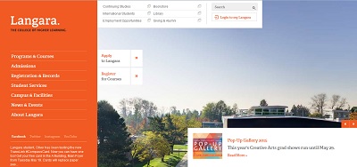
 The Home page has a very simple design to it, but in some ways is perhaps too simple, there is no attention-getter on the home page, nothing to tell me what Langara College is all about, just a menu and a big picture. This unfortunately means that the college is missing a ton of opportunities to engage visitors right from the moment they land on the site’s home page. The Navigation system has a bit of a retro feel to it, being located in a left sidebar, a style not commonly used on modern sites, but it works quite well and is very intuitive. The design is overall good, aside from the failure to grab a new visitor’s attention on the home page.
Ratings:
- Organization: 10/10
- Navigation: 9/10
- Design: 5/10
- Consistency: 10/10
- Contrast: 10/10
- Above the Fold: 0/10
- Performance: 8/10
- Layout: 7/10
Douglas College
 The first thing I notice on their home page is a minimalist design style, with a basic white background and black text. Dominating the screen on the home page, in the “Above the Fold” area is a huge sideshow. I find this to be inefficient use of the most valuable space on their website as such sideshows in my experience rarely produce much results.
In fact, in an article on www.usefulusability.com, Certified Usability Analyst Craig Tomlin shows how these rotating sliders, completely kill the conversion rates of all websites that use them, with less then 0.1% of all users clicking on them, and that users do not stay on a page for long enough to even see all the contents of the sliders. This is what Douglas College relies on exclusively to present its message above the fold on its home page.
The rest of the site is quite good, and follows a consistent design with a modern style of navigation system at the top of the page. There is one major flaw however, as the “Student Employment Center” link in the menu sends the visitor to a completely different looking set of pages with no way to navigate back using the site’s main navigation system, as this gets replaced by a new navigation system. The feel is that this item sends the visitor off site.
Ratings:
- Organization: 10/10
- Navigation: 6/10
- Design: 5/10
- Consistency: 10/10
- Contrast: 10/10
- Above the Fold: 1/10
- Performance: 9/10
- Layout: 9/10
SFU
 This site again fails to take advantage of the most valuable real estate on the whole site, the Above the Fold section of the home page. After going over the pages, I saw very little information on the pages I reviewed, mostly very short phrases or paragraphs. This means the website is not really selling the university effectively. This also makes it hard to rank the site on Google searches as well, as Google needs contents to index a site for relevance.
The main design features are good however, as the navigation is intuitive and I found no major flaws with the site. It is consistent, has good contrast and information is readily find-able in only a few clicks. With the help of a good copywriter to add more written contents, this site has the potential to be very good, the best of the 3 sites in fact.
Ratings:
- Organization: 10/10
- Navigation: 10/10
- Design: 8/10
- Consistency: 10/10
- Contrast: 10/10
- Above the Fold: 5/10
- Performance: 10/10
- Layout: 10/10
If you have a website you would like reviewed, or you have any questions about your website or blog, feel free to drop me a comment below.


